

Project: Mystery in a Corner
Designer: Gay Ann Rogers
Type of needlework: Needlepoint
Photos: 34
Gay Ann's website: http://www.gayannrogers.com/site_2/Home_Page.html
Gay Ann's blog: http://gayannrogers.blogspot.com/
Gay Ann's Classroom at SNS: http://groups.yahoo.com/group/SNS_GAR_Classroom/
Shining Needle Society: http://www.shiningneedlesociety.com/
Comments: One of the goal for Gay Ann Rogers in her Shining Needle Society classroom when she suggested Mystery in a Corner for our collective project was to help us learn a bit more about colors.
At first, I resisted that new project mainly because I already had so many different projects in progress and lots more waiting in the wings, but after giving it quite a bit of thought, I decided to go ahead and participate because as I said before it had been designed to help us with color decisions, something that I can always learn more about.
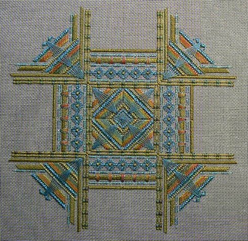
The first decision I had to make was to choose the colors. I selected Woodlands as my Watercolour and then Pam from Tomorrow's Heirlooms picked up the additional threads to make my special combination. I thus ended up with the following colors: greens, blues, topaz with my already selected Woodlands Watercolours.
There is a lot of photos in this blog entry as one of my goal while doing this project was to end up with a visual documentation of what actually happens when I put a certain color next to another one. I have found fascinating to see the impact that each successive colors had on the previous ones.
Once I got all my colors in front of me, then I realized that although I liked all the colors, I prefered the blue, so during all the days that I stitched on this project I was there rooting for BLUE. I wanted BLUE to win over the other colors. Some days it seemed that things were going my way and on other days, they were not, so I kept stitching until they were going my way (grinning).

(My thread selection: My Watercolor selection done from some Waterlilies threads I had at home. Interestingly
enough there seemed to have had more blue in it than the actual Watercolor. I do love that green but that blue
really appeals to me )

(From here on there will be a succession of photographs showing all different steps.
On this one I just love to see all that BLUE)

(BLUE followed by Topaz)

(Some Watercolor added with some orange tints)

(BLUE is winning here)

(BLUE still doing good)

(BLUE looks great but there is lots of green too)

(Lots of green. Where is my BLUE?)

(WOW, Lovely BLUE)

(Even more BLUE here)

(Let's bring all that BLUE)

(Green added but can still see lots of BLUE)

(Still happy with my BLUE)

(Looks like a mixture of BLUE and green here)

(OUPS, getting greener and greener here)

(Even more green - where it my BLUE?)

(Things are not getting any better)

(Oups, a tiny bit of additional BLUE)

(Topaz added after my little bit of BLUE)

(Love the BLUE)

(A tiny bit more BLUE)

(Adding a bit of Watercolor with a bit of orange in it)

(Adding a bit more BLUE)

(NOW we are talking, more BLUE that we can really see)
(A bit more BLUE)

(YOUPPEE, more BLUE)

(Things are really going well, MORE BLUE)

(Oups, a bit of green)

(We can barely see the additional BLUE here)

(Green added)

(Lots of green but I can still see some nice BLUE too)

(Well that is ONE way of adding BLUE with a BLUE MAT)

We now have a BLUE Mat but with a green frame
Oh well, that is what we call making a "Compromise"